What is a landing page, and more importantly, how can you make money from them? A landing page is a webpage that you send people to when they respond to your advertising. It is where they initially ‘land’ when they click on your ad or some other external link.
3 Types of landing pages
You can use any page as a landing page (LP), however, since the traffic to landing pages often comes from paid advertising, most LPs focus on monetizing the traffic.
- Sales page: any page that is designed to facilitate an immediate sales transaction.
- Handshake page: any page that is designed to collect contact information.
- Squeeze page: a specialized handshake page which is designed to maximize conversion rate. Really, all pages should be designed to maximize conversions. But a squeeze page is different in that it has a very narrow focus regarding the kind of action you want your visitors to take. Squeeze pages tend to convert better than other styles of landing pages, and every marketer should know how to develop a high-converting squeeze page.
What is a Squeeze Page?
A squeeze page has limited navigation and no outgoing links. This reduction in navigation and outgoing links forces the user to either do what the marketer wants them to do, or abandon the page altogether. Thus, it is called a ‘squeeze’ page.
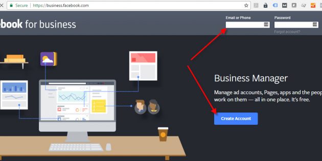
In the example below, Facebook gives only two options: Login and Create Account. And if you are not a member, you only have one viable option: Create Account. Non-members are squeezed into joining.
Most marketers find that the fewer distractions there on the page, the higher the conversion rate is. But I have seen the odd case where a reduced menu actually reduces conversion rate. This observation flies in the face of the belief that ‘fewer distractions is always better’. And I don’t want to confuse you. But I do want to point out that your conversion rate is fragile. Small things can make a difference. That is why your method must always be to test, never assume.
There is a science to creating great squeeze pages. Once you start creating squeeze pages, you’ll discover what works for you and what doesn’t. You can then refine your methods so that your pages convert better and capture more leads. It’s different from website design, where there’s possibly more room for frivolous creativity.
As you start working with squeeze pages, you’ll discover what works best for your market, but there are some elements that are common to all good squeeze pages.
What is your Objective?
Start by asking a simple question – What do you want your visitors to do? There should be one single action. Everything on your squeeze page should lead the visitor to this action.
Think of your squeeze page as a waterslide. It starts at the headline and leads the visitor shooting through the content to the opt-in form Once on the slide, there is no easy way off. If a squeeze page is well-made, your visitors will slide right through and take the action you wish them to take.
Ad Scent
Make sure that your squeeze page relates to your ad or link they clicked to get there. The ad or link makes a promise as to what the visitor is going to find when they click it. Your squeeze page should deliver on that promise. If a visitor clicks the link only to find something different than what they expected, they’ll click away.
For example, if your ad says, ‘Click here to get a 50% discount on the latest Dell PC,’ but the squeeze page says, ‘Welcome to Bill’s Computer Store,’ the visitor will leave. Instead, it should say something like, ‘Are you ready for your 50% discount on the latest Dell PC? Get it here!’ The message of the squeeze page and ad need to be consistent. This is known as ‘ad scent’. If the scent on the teaser matches what they find on the landing page, you’ll have higher conversions.
Compelling Copy
Visitors will look at your squeeze page for about 3 seconds before they decide to either keep reading or click away. Your copy needs to grab their attention within these few seconds. The way to do this is through compelling copy, which means:
Headline:
The headline should grab the visitor’s attention and speak to their needs or problems. A question that asks something like, ‘Are you sick and tired of…?’ or ‘Wouldn’t you like to finally…?’ are good. These make the reader say, ‘Yes, that’s me!’
Sub-Heads:
Sub-headlines clearly inform the visitor what each section of the page is about (most visitors skim and scan rather than read every word). The idea behind sub-heads is to lead the reader down the page as if it’s a slide that ends up with the call to action (CTA).
Copy:
Copy should be simple, direct, conversational and easy to understand. It should be written like an email to a friend, using the word ‘you’ or ‘me’ or ‘my’ periodically. Content should focus on benefits and results. Don’t just explain features of your offer, but the actual benefits the visitor receives and how it solves their problems or improves their life. Make it obvious so that they don’t have to assume. Use bullet points to emphasize benefits (remember: they’re skimming and scanning, not reading).
There are complete courses on copywriting and there isn’t enough space to cover it here, but there are certain ‘selling’ words that have a psychological effect on the reader. These words include ‘free,’ ‘discover,’ ‘secrets,’ ‘results,’ ‘quick,’ and ‘guarantee.’ For ideas on how to write in this style, look at some squeeze pages that you yourself have found compelling.
For some markets, it is good to use a bit of humor if you can. Humor makes a squeeze page more fun to read and can hold your readers’ attention. If you’re not sure whether you’re writing is funny or not, ask others for feedback.
The copy of your squeeze page doesn’t have to be long. In fact, some squeeze pages have almost no text at all. It just needs to draw the reader in and get them to complete the sole action you want them to complete.
Squeeze Page Design Tips
Keep it Simple
Your squeeze page should be simple. It doesn’t need any bells and whistles. Too many design features can distract and this can cost you conversions. Remember that the primary purpose is to lead the visitor to the single CTA. Anything that doesn’t do that should be removed.
Focus on the Lead Bait
Don’t try to sell the company or the history or the products. Focus on the Lead bait.
Above the Fold
Put all the important information at the top. The essentials should be ‘above the fold,’ meaning that the visitor should not have to scroll down to see them. Visitors only spend 3-4 seconds on squeeze pages before they either decide to keep reading or click away, so you need to spell out the benefits of signing up clearly.
Remove Outgoing Links
By removing outgoing links, you are eliminating distractions and keeping your prospects focused on the one action you desire them to take.
Landing pages for advertising do need to have links to your privacy policy and website terms. Put those links at the bottom. Ad platforms such as Facebook and Adwords don’t like landing pages that are dead ends. They want people to be able to escape and explore.
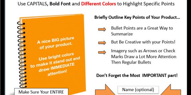
Use Images
Images of your lead bait are good for squeeze pages and often increase conversions. While you should keep your page simple and strip away anything unnecessary, images that relate to the offer can have an even greater impact than any text you use. The stand out like a headline and create immediate perception of value.
The best images are attention grabbing and colorful. Smiling faces have been shown to increase conversions, as well as images of people looking at your opt-in form. There are stock images all over the web that you can use, but these are best avoided. Get creative and choose a unique image.
What about Video?
On a sales page, a long-form video can be invaluable. However; on a simple handshake page, you need to take into consideration the cost and time involved in creating the video. I would never recommend creating a video before split testing the offer to make sure you have a great converting offer to begin with. Then, if budget and time allow, add a video to your testing regime.
If you do use a video, start by keeping it focused on the same essential facts you have been using in text-only version. Don’t stray far from the copy points you know to work.
Test having the video autoplay when the visitor initially hits the page. Usually you’ll get better conversions, but again, you need to test it.
Test a version of the video with subtitles. Some visitors may be in a public place or an open office, and thus not be able to turn up the audio.
When placing the video, it can be shown in conjunction with the original text. Test that against replacing the text with the video.
Some visitors prefer video to text content while others prefer the text, so test as many variation as your traffic will reasonably allow for.
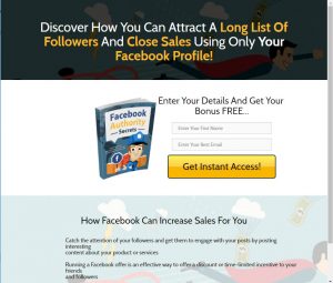
Call to Action
The last and most important element of a squeeze page is the call to action (CTA). The CTA tells the visitor exactly what action they need to take to receive the benefits of the bait and it urges them to take immediate action.
This last part is important. You need to tell the visitor, ‘Click here to receive your free download.’ Don’t place a download button on the page and expect them to take this action themselves. The action word has a subtle psychological effect.
The CTA should be placed near the top where it’s easy to see so that visitors can sign up immediately if they want to. It should also be placed throughout the page if you have a lot of content. The best practice is to place it so that anywhere people are scrolling on the page, they can see a CTA and sign up form.
Along with the CTA, you may want to tell the visitor that this is a one-time or limited availability offer (if it is) and you’ll get the scarcity effect. By telling the visitor that they have only a limited time, you raise the fear of missing out and further incentivize the prospect to take immediate action.
Polishing Your Squeeze Page
When you have finished with your squeeze page, take the time to spellcheck and read over it for typos. One of the main purposes of a squeeze page is to gain the visitor’s trust. If it’s riddled with typos and errors, you won’t gain this trust.
When looking over your finished squeeze page, ask yourself if there is anything you can cut. Remember that the simpler and more streamlined your squeeze page is, the more effective it will be. Remove anything that doesn’t lead the visitor to submitting their email address.
Squeeze Page Conversion Rate Optimization (CRO)
The basic law of marketing is “it can always be better”. CRO needs to be applied to your entire marketing system, and the first place to begin is optimizing your squeeze pages.
A squeeze page is a work in progress. Once you finish your squeeze page, you’ll need to find ways to improve it by making changes that result in more conversions. Here are a few standard improvements that tend to increase conversions.
Put up a Split Test (AB test)
AB testing is a staple of your work as a marketer. It is not optional. If you want better results tomorrow than you are getting today, then you must test. Never put up a handshake page of any type without also adding a variation.
It generally takes very little time to build an experiment, and over time, one of your variations will prove itself to be better. In this sense, your handshake page automatically optimizes itself, but only if you put up the experiment. When is the best time to put up an experiment? When you initially launch your handshake page. When is the second-best time? Now!
I prefer to test the offer, the call to action, the headline and the images, in that order. But before you begin you should review case studies of other similar offers. Just do a search for ‘case studies AB testing’ or ‘examples AB testing’.
Test Your Offer
This is the most important item to test. It is here that value is created. What do I get out of it? That’s the question you must answer.
Test Your Call to Action
Previous studies have shown that ‘See Pricing’ will outperform ‘Request a Quote’ by wide margins. My point? It’s not just what you ask them to do, but how you ask them to do it.
Test Your Headline
For almost three decades I have leaned on the research of Dr. Starch, of the Starch Report. He conducted readership research on how people consumed newspapers. He discovered that headlines are read five times more than body copy. That means 80% of your ad budget is used to get people to read your headline. Make it big, bold, juicy, exciting, enticing, irresistible. If you lose them at your headline, your body copy doesn’t have a chance. Worth testing.
Test Your Primary Images
The image of your offer is the first thing their eye should be drawn to. And it should smack of value. This image is defiantly worth testing.
And it is amazing how changes to the look of your CTA button can make a difference in conversions. Don’t get hung up on design elements. Just make sure that your button looks like a button. And make it visible. You’ve seen download buttons on websites before. Some are very clear while others are hard to find. Make sure yours is clear and obvious.
You should be creating heat maps of your squeeze pages. If people are not hovering over and clicking your button, try making it bigger and brighter.
Integrate the Secret Handshake
If your primary CTA is a form that you want them to fill out, use the Secret Handshake to maximize conversions. You don’t even need to test this. Consider it best practice.
On the initial form, ask only for an email address. Asking for more information on the initial form will reduce your conversion rate.
When the prospect clicks the submit button, rather than taking the prospect to a thank you page, instead take them to a second form where you ask them for more information, such as name and phone number. Your overall conversions will be higher.
You can ask for more than just name and email address. Some marketers offer optional fields that help them segment prospects when they first sign up (there are also ways to segment your subscribers once you start marketing to them through email). If your list is segmented, you can target them with more relevant messages and offers and increase conversions. However; do not do this on form #1. Do it on form #2, because asking loads of questions will scare people off.
On the other hand, you want to ask questions that your prospects expect.
Lose the Loading Time
If you have videos or other design elements that take time to load, you may want to try testing your squeeze page with and without them. Remember that some of your visitors are viewing your squeeze page on ancient computers that don’t load videos well. You’re losing people during this loading time, so simplify or remove anything that takes a long time to load.
To test the speed of your page, use Google’s page speed tester.
You can also try these Speed Test sites:
The Micro-Micro Commitment
If your conversions are low, test asking for even less commitment. This is an advanced tactic, so don’t bother with it unless you already have other handshake pages up and running on your site.
This technique involves asking an initial question to get the prospect moving, without requiring them to fill in any personal information at all.
For example, you could say:
Get your Free Fashion Report
The prospect is more easily drawn into the process because there is no risk associated with the initial question. No personal information has been requested.
You can lead the prospect through one or more questions like this, then present them with your first data collection form.
The series of micro-commitments warms them up and reduces anxiety, thus increasing conversions. The trick is to make the initial questions enticing and interesting.
You don’t want your prospects to feel betrayed when they see the request for their email address, so don’t make the micro-micro commitment process too long. And don’t trick them with untrue copy that implies they won’t have to register. You don’t need to disclose the full sequence to them in advance, but don’t lie about it either.
7 Squeeze Page Mistakes
We’ve covered the basics you need to know to get started building squeeze pages, but just to recap some of the do’s and don’ts, here are common mistakes you should note and avoid:
1. Too Much Going on
Remember that a squeeze page should be simple. It should lead the visitors straight to the sign-up form. There should be nothing to distract along the way. Don’t build cluttered squeeze pages that give visitors too many things to look at. Make it clean and simple.
2. Outgoing Links
Likewise, you don’t want to lead visitors off your page. You may like to place links to sites you like or that have more information, but it’s a big mistake to put links on a squeeze page. Links are like holes that your prospects can slip through. Don’t even put a link to your other web pages on the squeeze page. Save the helpful links for your main website itself. Most ad platforms will require you to have a privacy and website-usage policy. Place those links in the footer. Don’t make them dominant or eye catching.
3. Dull Copy
The copy of your squeeze page is extremely important. It needs to gain the reader’s attention, resonate with them, and offer the solution they’re looking for. A squeeze page with boring, dry copy won’t do this. If you see your visitors spending little time on your page or bouncing off in high numbers, brush up your copy. If you really want it to shine, hire a professional copywriter to do it for you.
4. Inconsistent ad scent
If you have a high bounce rate, this may mean that your squeeze page isn’t relevant to the offer you made in the ad or traffic source. Remember that the message of your squeeze page needs to be consistent with the promise at the source. Your visitors need to know that they’ve ended up in the right place. The more consistent the ad scent, the higher your conversions will be.
5. Bad Call to Action
If you have high traffic but low conversions, it could be your call to action (or lack of it). Don’t expect your visitors to know what they have to do on your squeeze page. Hold them by the hand and tell them exactly how they can enjoy the benefits your offer. Tell them to enter their information and click the button.
6. Weak Offer
Just because you’re giving away a freebie, it doesn’t mean that the offer can be perceived as cheap. Quite the opposite is true. Your objective is the maximize perception of value during the packaging process. Make it sound truly valuable that your visitors will really want. Spend some time creating a product or offer that’s worth giving up personal information, then package the heck out of it. Make big promises, then fulfill them.
7. No Testing
Finally, remember that a squeeze page isn’t something to set and forget. Constantly test and make changes to improve your squeeze page. Savvy marketers know how to make excellent squeeze pages because they’ve done it over and over and learned how to get results. With experience, you’ll learn how to do it well too.
Squeeze Page Template
This squeeze-style landing page template can easily be modified for your offer and business.
The download package includes:
- HTML landing page
- Images
- CSS
- Fonts
- HTML confirmation page
- Responsive design